Creating professional diagrams—whether for business process modeling (BPMN), system architecture, or data flow—is both an art and a science. While tools make the drawing easy, true mastery lies in applying structured design principles, validating your work against rigorous standards, and ensuring your diagrams serve as living documents that evolve with your organization. This tutorial walks you through the essential pillars of creating clear, accurate, and collaborative diagrams that stand the test of time.
Why Professional Diagrams Matter
Diagrams are not just visual aids—they are communication tools that bridge technical and non-technical stakeholders. A well-designed diagram can clarify complex processes, uncover inefficiencies, align teams, and serve as documentation for audits or training. Conversely, a poorly constructed diagram can mislead, confuse, or even cause operational errors. That’s why following best practices isn’t optional—it’s foundational.
Design Principles: The Foundation of Clarity
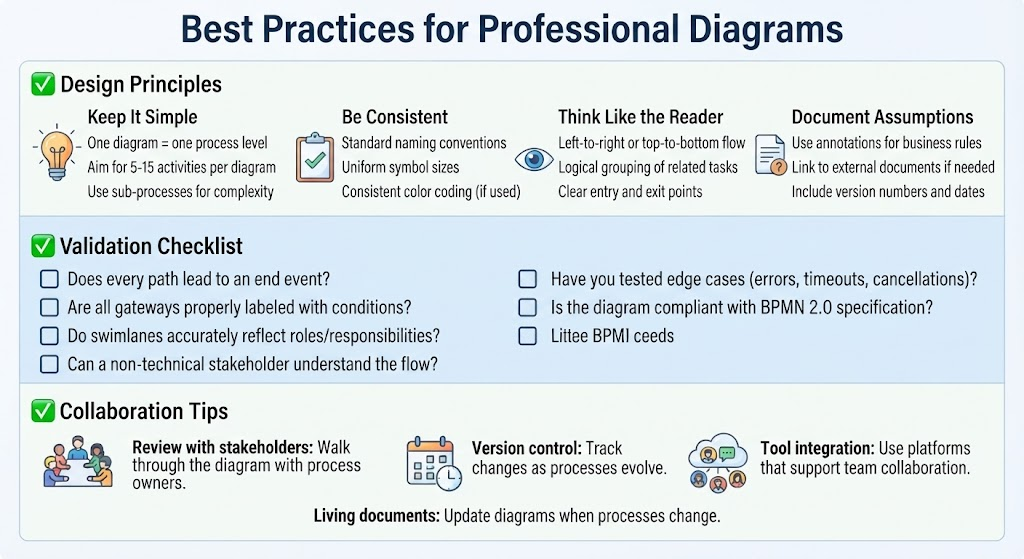
Great diagrams start with intentional design. These four core principles ensure your diagrams are readable, consistent, and audience-focused.
1. Keep It Simple
- One diagram = one process level: Avoid cramming multiple layers of abstraction into a single view. If you’re modeling a high-level workflow, don’t dive into task-level details. Save those for sub-diagrams.
- Aim for 5–15 activities per diagram: Cognitive load limits how much information a human can process at once. Staying within this range keeps your diagram digestible.
- Use sub-processes for complexity: When a process becomes too large, encapsulate it into a collapsed sub-process and link to a detailed diagram. This maintains clarity while preserving depth.
2. Be Consistent
Consistency reduces cognitive friction. Readers shouldn’t have to guess what a symbol means or why colors vary.
- Standard naming conventions: Use action verbs for tasks (“Approve Invoice,” not “Invoice Approval”) and noun phrases for roles or systems (“Finance Department,” not “Fin Dept”).
- Uniform symbol sizes: Keep shapes proportionate. A giant rectangle next to a tiny circle breaks visual harmony and distracts from meaning.
- Consistent color coding (if used): If you use color, define a legend and stick to it. For example, red for exceptions, green for success paths, blue for system interactions.
3. Think Like the Reader
Your audience—whether developers, managers, or clients—needs to follow your logic intuitively.
- Left-to-right or top-to-bottom flow: Align with natural reading patterns. Rarely should you force readers to backtrack or jump across the page.
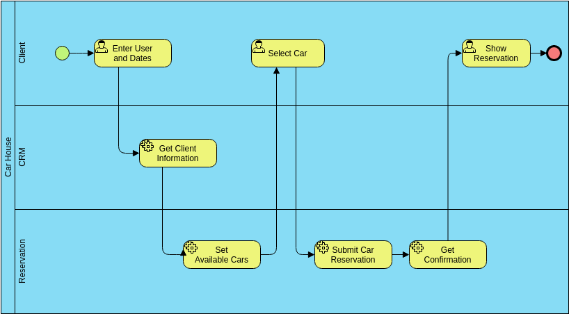
- Logical grouping of related tasks: Use containers, swimlanes, or annotations to cluster activities by function, team, or system.
- Clear entry and exit points: Every diagram should begin with a start event and end with a clear conclusion (end event, rollback, or handoff).
4. Document Assumptions
Diagrams often omit context for brevity—but that context is critical for interpretation.
- Use annotations for business rules: Add notes explaining constraints (“Only approved by Manager if amount > $5,000”).
- Link to external documents if needed: Reference policy manuals, SLAs, or API specs via hyperlinks or footnotes.
- Include version numbers and dates: Never let a diagram become outdated without traceability. Versioning ensures everyone works from the same source.
Validation Checklist: Ensuring Accuracy and Compliance
Before publishing or presenting a diagram, run it through this validation checklist. It’s your quality gate against ambiguity, incompleteness, or non-compliance.
Structural Integrity
- Does every path lead to an end event? Dead ends confuse users and may indicate missing logic or error handling.
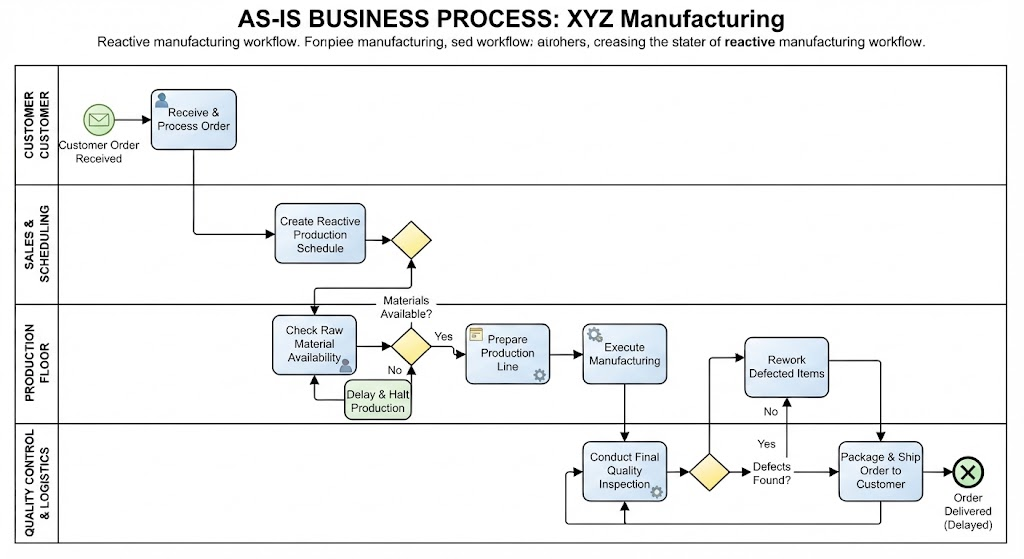
- Are all gateways properly labeled with conditions? Exclusive gateways (XOR) must show decision criteria (“If approved → Yes / If rejected → No”). Parallel gateways (AND) should imply simultaneous branching.
- Do swimlanes accurately reflect roles/responsibilities? Each lane should represent a distinct actor (person, system, department). Misassigned lanes break accountability.
User-Centric Validation
- Can a non-technical stakeholder understand the flow? Test your diagram with someone unfamiliar with the process. If they stumble, simplify or annotate further.
- Have you tested edge cases? What happens on timeout? Error? Cancellation? Include alternative paths for real-world scenarios.
Technical Compliance
- Is the diagram compliant with BPMN 2.0 specification? If using BPMN, adhere to official symbol sets and semantics. Deviations risk misinterpretation by tools or auditors.
Collaboration Tips: Making Diagrams Living Documents
Diagrams shouldn’t be static artifacts—they should evolve with your processes. Collaboration ensures accuracy, adoption, and longevity.
Review with Stakeholders
Walk through the diagram with process owners. Their insights catch gaps you might miss. Ask: “Does this match how you actually do it?” and “What’s missing?”
Version Control
Track changes as processes evolve. Use tools that support branching, commenting, and history. Label versions clearly (e.g., v1.0, v1.1-updated-approval-flow).
Tool Integration
Use platforms that support team collaboration—like Lucidchart, Draw.io, or Camunda Modeler. Enable real-time editing, comments, and permissions to keep everyone aligned.
Treat Them as Living Documents
Schedule periodic reviews. Update diagrams when processes change, new regulations emerge, or feedback reveals flaws. A diagram that hasn’t been updated in a year is likely obsolete.
Final Thoughts: Excellence Through Discipline
Professional diagrams are more than pretty pictures—they’re strategic assets. By adhering to design principles, validating rigorously, and fostering collaboration, you transform diagrams into trusted blueprints that drive clarity, efficiency, and alignment across your organization.
Remember: The best diagram is the one your audience can read, trust, and act upon. Build yours with intention, validate with care, and maintain with commitment.