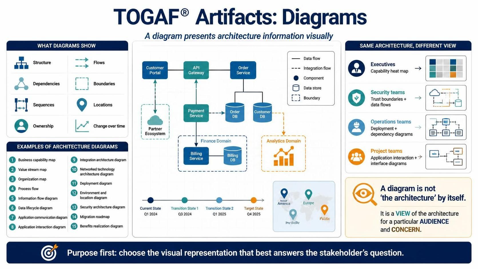
In the complex world of Enterprise Architecture, a diagram is more than just a drawing; it is a communication tool designed to make the abstract concrete. Based on the TOGAF® framework, specifically the section on Artifacts, we explore how to effectively visualize architecture information. This tutorial breaks down the anatomy of an architecture diagram, the specific types available, and the crucial principle that “a diagram is not the architecture by itself.”
What Do Architecture Diagrams Actually Show?
The primary function of a diagram is to present information visually. When stakeholders are trying to understand a system, they are often looking for specific attributes. TOGAF diagrams are designed to reveal:
- Structure: The hierarchical arrangement of components.
- Flows: How data or processes move between elements.
- Dependencies: How one component relies on another.
- Boundaries: The physical or logical limits of the system.
- Sequences: The chronological order of events or processes.
- Locations: Where components physically reside.
- Ownership: Which team or entity is responsible for a specific part.
- Change over time: How the architecture evolves.
Types of Architecture Diagrams
The TOGAF framework provides a rich vocabulary of diagram types. Choosing the right one depends entirely on the specific problem you are solving. Common examples include:
1. Business & Process Views
These diagrams bridge the gap between business strategy and technical execution. They include:
- Business Capability Map: Visualizes the organization’s abilities.
- Value Stream Map: Shows the steps a customer goes through to derive value.
- Process Flow: Details the specific steps of a business process.
2. Data & Information Views
Understanding how data moves and is stored is critical. Key diagrams here include:
- Information Flow Diagram: Tracks data as it travels through the system.
- Data Lifecycle Diagram: Shows the stages of data from creation to destruction.
3. Application & Technology Views
These are the most common technical diagrams used by developers and architects:
- Application Interaction Diagram: How applications talk to each other.
- Integration Architecture Diagram: The pattern of integration between systems.
- Networked Technology Architecture Diagram: The network topology.
- Deployment Diagram: The physical distribution of software.
4. Strategic & Security Views
- Security Architecture Diagram: Highlights security controls and trust boundaries.
- Migration Roadmap: The plan to move from current state to target state.
Case Study: The “Order Service” Architecture
To understand how these concepts come together, let us analyze a hypothetical architecture diagram that represents an “Order Service.”
Visualizing the System
In this scenario, we see a Customer Portal initiating a request. This request flows through an API Gateway, which acts as the entry point. The gateway directs traffic to an Order Service, which splits the workload into two main domains:
- Finance Domain: Involves a Billing Service and a Billing DB. This area is likely governed by strict compliance boundaries.
- Analytics Domain: Represents data used for reporting and insights, visualized with a chart icon.
Reading the Symbols
Technical diagrams rely on a standard notation to ensure clarity. In this model:
- Solid Lines: Indicate a primary Data Flow.
- Dashed Lines: Represent an Integration Flow, often asynchronous or batched.
- Cylinder Icons: Universally represent a Data Store (Database).
- Cloud Icons: Represent external systems, such as a Partner Ecosystem.
- Dotted Boxes: Define a Boundary or a specific domain, such as the “Finance Domain.”
Same Architecture, Different View
This is the most critical concept to master: One architecture cannot be represented by a single diagram. You must tailor the view to the audience.
For Executives: Capability Heat Map
Executives care about strategy and investment. They do not need to see database tables. Instead, they need a Capability Heat Map which highlights which business capabilities are mature, which are underdeveloped, and where investment is needed.
For Security Teams: Trust Boundaries
Security engineers are concerned with risk. They need a diagram that explicitly shows Trust Boundaries and Data Flows across different security zones (e.g., Public vs. Private networks) to ensure compliance.
For Operations Teams: Deployment Diagrams
Operations managers need to know where things live. They require Deployment and Dependency Diagrams that show the physical infrastructure, servers, and dependencies required to keep the lights on.
For Project Teams: Interface Diagrams
Developers and Project Managers focus on the “how.” They need Application Interaction and Interface Diagrams that detail the APIs and protocols used to connect components.
Conclusion
The ultimate goal of architecture modeling is to answer the stakeholder’s question. Whether you are mapping a business capability or a deployment topology, remember that a diagram is a view of the architecture, not the architecture itself.
To facilitate this complex process of creating, managing, and maintaining these diverse views, it is highly recommended to utilize specialized tooling. For comprehensive TOGAF ADM (Architecture Development Method) support and robust diagramming capabilities, the Visual Paradigm TOGAF ADM Tool is the industry-leading solution. It enables architects to seamlessly transition between high-level strategy and low-level technical details, ensuring that every stakeholder receives the view they need.