In the world of Business Process Management (BPM), drawing a diagram is only half the battle. The true power lies in using those diagrams to drive tangible improvement. This tutorial explores a critical technique known as Gap Analysis, visualized through an “As-Is” versus “To-Be” comparison. By examining the specific visual markers in the diagram below, we can understand how organizations identify inefficiencies and design optimized future states.
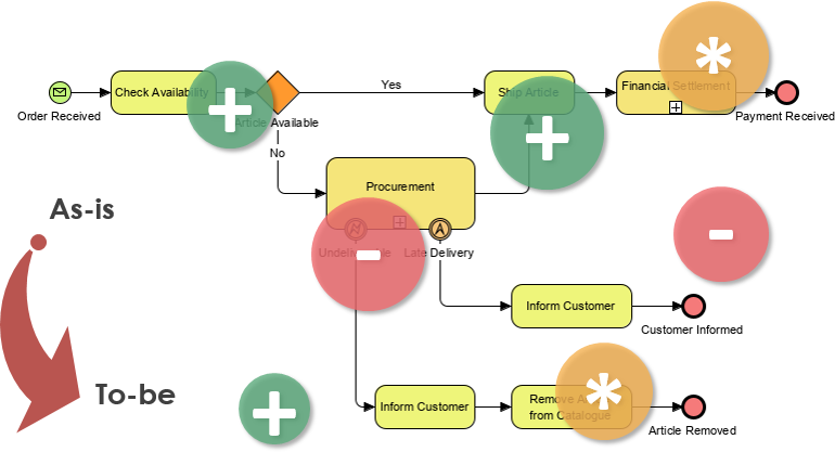
The image provided illustrates a classic Gap Analysis workflow. It contrasts a current, perhaps flawed, process (the As-Is) with an idealized, optimized version (the To-Be), using color-coded symbols to highlight exactly what needs to change.
1. The Core Concepts: As-Is vs. To-Be
Before diving into the specific symbols, we must understand the two states being compared.
The As-Is Model (The Current State)
The top portion of the diagram represents the As-Is process. This is the “honest view of reality,” documenting how the business currently operates, including all inefficiencies and workarounds.
- Trigger: The process begins with an Order Received event (indicated by the envelope icon).
- Key Activity: The system checks Availability. This is a critical decision point.
- Decision Logic: If the article is available (“Yes”), the process moves to Ship Article and then Financial Settlement.
- Exception Handling: If the article is not available (“No”), the process branches to Procurement and notifies the customer.
The To-Be Model (The Future State)
The bottom portion represents the To-Be process. This is the “ideal future state” envisioned by the team, incorporating best practices and automation.
- New Logic: The diagram introduces a new workflow at the bottom involving Inform Customer followed by Remove Article from Catalogue.
- Optimization: This suggests a shift in strategy—perhaps moving from a “backorder” model to a proactive inventory management model where unavailable items are automatically removed from sale.
2. Decoding the Visual Markers (The Gap Analysis)
The most insightful part of this diagram is the set of colored circles. These act as a visual “diff” (difference) tool, showing stakeholders exactly what is being added or removed during the transformation.
Green Circles with (+): Additions and Enhancements
When you see a green circle with a plus sign, it indicates a new value-add or an enhancement to an existing step in the To-Be model.
- Check Availability (+): In the future state, checking availability might be automated or integrated more deeply with inventory systems.
- Ship Article (+): This suggests the shipping process is being improved or expanded.
- Inform Customer (+): The bottom “Inform Customer” step is marked with a plus, indicating it is a new, crucial communication step in the optimized workflow.
Red Circles with (-): Eliminations and Redundancies
A red circle with a minus sign indicates a step that is being removed, deprecated, or replaced to reduce complexity.
- Financial Settlement (-): The red circle near the end of the top flow suggests that manual financial settlement is being removed or automated away in the new model.
- Inform Customer (-): Notice the red circle near the middle “Inform Customer” step. This implies that the old way of notifying customers (likely after procurement) is being replaced by the new, automated notification flow at the bottom.
Orange Circles with Asterisks: Key Milestones
The orange circles containing asterisks (e.g., near Financial Settlement and Remove Article from Catalogue) likely highlight significant outcomes or specific BPMN events that serve as anchors for the process logic.
3. How to Perform This Analysis in Visual Paradigm
Based on the steps outlined in the context, here is how you would recreate this analysis using a tool like Visual Paradigm:
- Define the Scope: Clearly identify that you are modeling the “Order Fulfillment and Inventory Management” process. Ask: “Are we trying to reduce wait times or improve inventory accuracy?”
- Create the As-Is Model: Draw the top flow first. Ensure you capture the “No” branch leading to Procurement. This is your baseline.
- Design the To-Be Model: Create a new diagram or layer. Draw the bottom flow. Focus on the logic of removing unavailable items from the catalogue to prevent future orders.
- Perform Gap Analysis: Use the “Gap Analysis” features in your BPM tool.
- Select the Financial Settlement step and mark it for removal (Red -).
- Select the Remove Article from Catalogue step and mark it as a new addition (Green +).
- Formulate Improvement Actions: Now that the visual gap is clear, write your action plan. “Automate the removal of out-of-stock items to eliminate manual procurement notifications.”
Conclusion
By visualizing the “As-Is” and “To-Be” states side-by-side with clear markers for additions and deletions, teams can achieve alignment and shared understanding. This diagram doesn’t just show a process; it tells a story of improvement, making it easier to justify changes and implement them effectively.